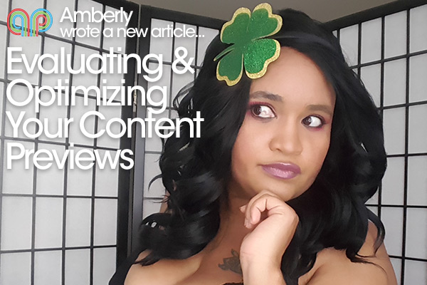
Evaluating & Optimizing Your Content Previews

Preview Reviews
First impressions matter, or at least that is how the old adage goes. When a customer first finds you, they will judge your content based on the thumbnails and previews. You have merely seconds to make them WANT to convert over and become YOUR customer. Should you look happy? Should it be at a jerkoff-able moment or should you leave them wanting more? There are so many different schools of thought, which one fits you?
Test, Test, Test, Test, TEST
Few will master the game of getting their previews perfect at first. For the vast majority of clip creators, it is a process of trail and error. That process can be shortened though by being wise in how you go about testing. Never test two things at once. If a clip starts selling crazily, you don’t want to have three new different things and not be able to attribute what exactly caused the response. You also want to keep track of what you were testing and on what days. Track your sales for those changes over time. What worked and what didn’t? This is a basic process ALL businesses deploy and as clip creators, we are no different.
Be Bold!
You need a great title to publish any clip but also put that title on your thumbnail and first few seconds of your clip. Most editing software allows this and it is pretty simple to do. Google the software you are using and how to add text to the screen. It only needs to be in the first few frames.
Be careful of the font you use and of course, where you place the text. You want it to stand out and be easily seen against the background of the thumbnail but not cover any of the action happening. Keep your fonts thicker too. The smaller the image, the less skinny fonts can be read. While many customers skim the titles that are on the screen, they tend to focus on the graphical previews, making your clip stand out more with the next on the screen!
Remember that the text doesn’t have to be just like the title either. Look at the thumbnails on Youtube for top videos. Many of them are simple one-word questions or at max 4 words. A strategically placed WHAT?!? Or CUM HERE!! Can be cute and enticing for the customer browsing!.
Show Enough, But Not More.
Many previews are either lacking in what they show (first few seconds of a clip) or they show way too much (the sexiest part). The sweet spot is in between. That sexy build-up to the key point of the clip. That point you are working someone up to, that you know will make them orgasm. What is that point? You want to highlight that in the clip. Now if your clip is really unique (a la the model who got her labia tattooed for the clip) you may decide it is best to show that on the preview. These are special cases though, as they have the additional WOW and rare factor.
The biggest take away though, relax! Many models get caught up in the preview creation process and it keeps videos from coming out. We are in the entertainment industry and we (above all else) should be having fun. Have fun making your previews and tweak them as need be and punch the air with pride, even if your clips don’t sell that well. Why? Because you now have more data to go into making your future content kick ass!
